10 Lightroom Mistakes That Are Holding Your Photography Back
I have the privilege of connecting with hundreds of thousands of photographers across social media every single day. And if there is one thing I see constantly, it’s the "editing struggle."
I see the posts in our Facebook groups, the DMs asking for critiques, and the frantic questions about why an image doesn’t look the way it did in the viewfinder. Most of the time, the frustration comes down to a few repeatable, fixable mistakes.
We often think the solution is a "magic" preset or a more expensive camera, but usually, it’s just a matter of understanding how to use the tools already in front of you. Today, we’re going to pull back the curtain on the most common Lightroom pitfalls and—more importantly—give you the exact roadmap to fix them.
1. The "Preset Trap"
We’ve all been there. You see a photographer you admire, you buy their $100 preset pack, you click it onto your photo, and... it looks nothing like you expected. The biggest mistake beginners make is treating presets like a "one-click fix."
Why it happens: Presets are recorded settings based on a specific photo’s lighting, white balance, and exposure. If your starting point doesn't match the creator's starting point, the results won't match either. When you don't understand what the preset is doing to your HSL sliders or your Tone Curve, you don’t know how to tweak it.
The Fix: Use presets as a starting point, not the finish line. Spend time learning what each slider actually does to your pixels. This is exactly what we cover in Intro to Lightroom—I want to teach you how to see the light first so you can make any preset work for you, rather than being a slave to a filter.
2. Skipping the "Foundational Work" for Instant Pop
When an image looks flat, the instinct is to grab the Contrast slider and crank it to +50. Stop! When you add heavy contrast to a flat image, you often end up with muddy shadows and nuclear highlights. It creates a "heavy" feeling that lacks professional polish.
The Fix: You have to build a foundation before you add the "pop." In The Lightroom Series, I teach a specific order of operations: lift your shadows, soften your highlights, and brighten your blacks first. This creates a clean, high-dynamic-range canvas. Once that foundation is set, you can add contrast or pop without making the image feel "crunchy."

3. Overusing the Temperature Slider for Warmth
We all love a warm, golden-hour glow. But when you use the global Temperature slider to add warmth, you're warming up everything—the skin, the grass, the sky, and even the dark shadows. This often leads to "jaundice" looking skin or muddy, neon-yellow greens.
The Fix: Leave your global White Balance as natural as possible. Instead, use the Color Grading tool to add warmth specifically to the highlights. This keeps the shadows clean and the skin looking intentional. If you want a specific "glow" on your subject, use a radial mask to warm up just the person, leaving the environment balanced.

4. Ignoring Color Casts
This is a small detail that separates the amateurs from the pros. If you’re shooting outdoors, the sky is a massive blue softbox reflecting onto your subject’s hair. If you’re shooting in a field, the green grass is reflecting onto their jawline. Fall foliage? White shirts turn pink under those trees.
Why it matters: These subtle casts make skin look "off" even if your exposure is perfect. Those random red patches that pop up in shaded areas or around the hairline can distract from an otherwise beautiful portrait.
The Fix: Train your eyes to hunt for these casts. Use the HSL (Hue/Saturation/Luminance) panel to target those specific blues or greens. Or better yet, use a brush to desaturate the "red ears" that often happen when cold weather or blood flow makes a subject's skin tone look patchy.
PS - In my Foundation Lab presets, I have a one-click color mixing that reduces red skin tones!

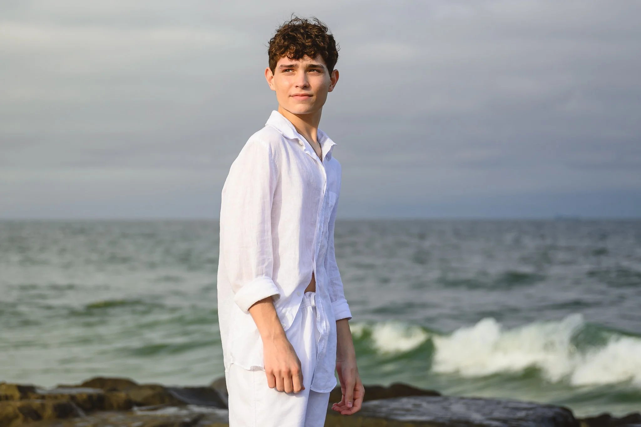
5. The "Orange Skin" Highlight Crisis
Have you ever edited a sunset photo where the sun hits the subject's hand or cheek and it turns a neon, radioactive orange? This happens because the sun’s warmth is doubling up with your editing adjustments, pushing the saturation past the breaking point.
The Fix: This is where masking becomes your best friend. Use a selective mask on the skin and slightly drop the saturation or shift the hue of the oranges/reds.
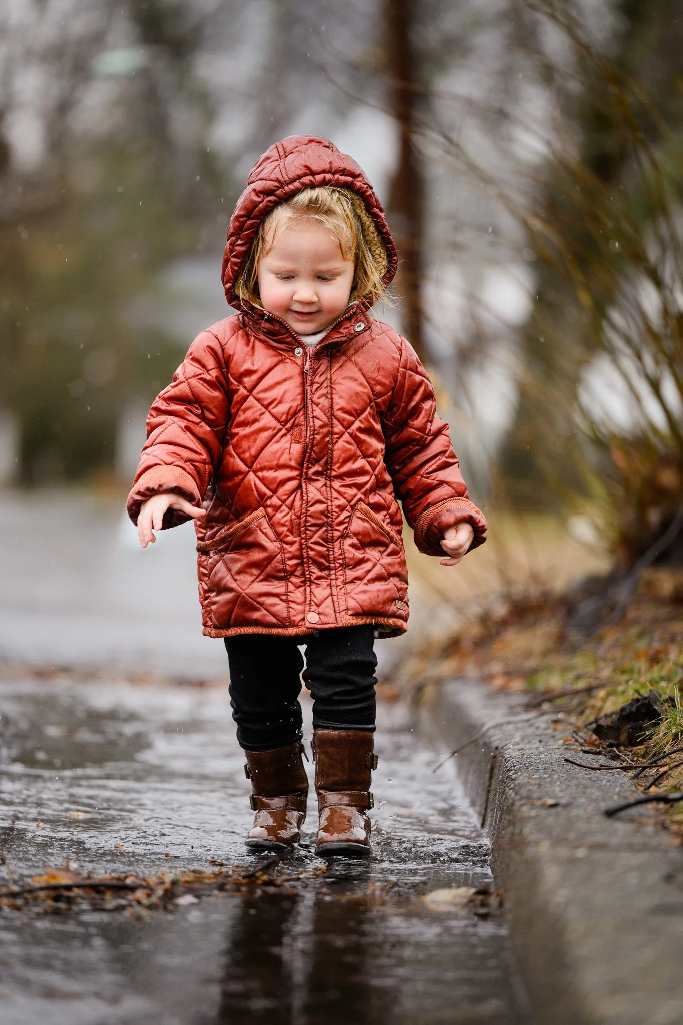
Let's Analyze a Real Example
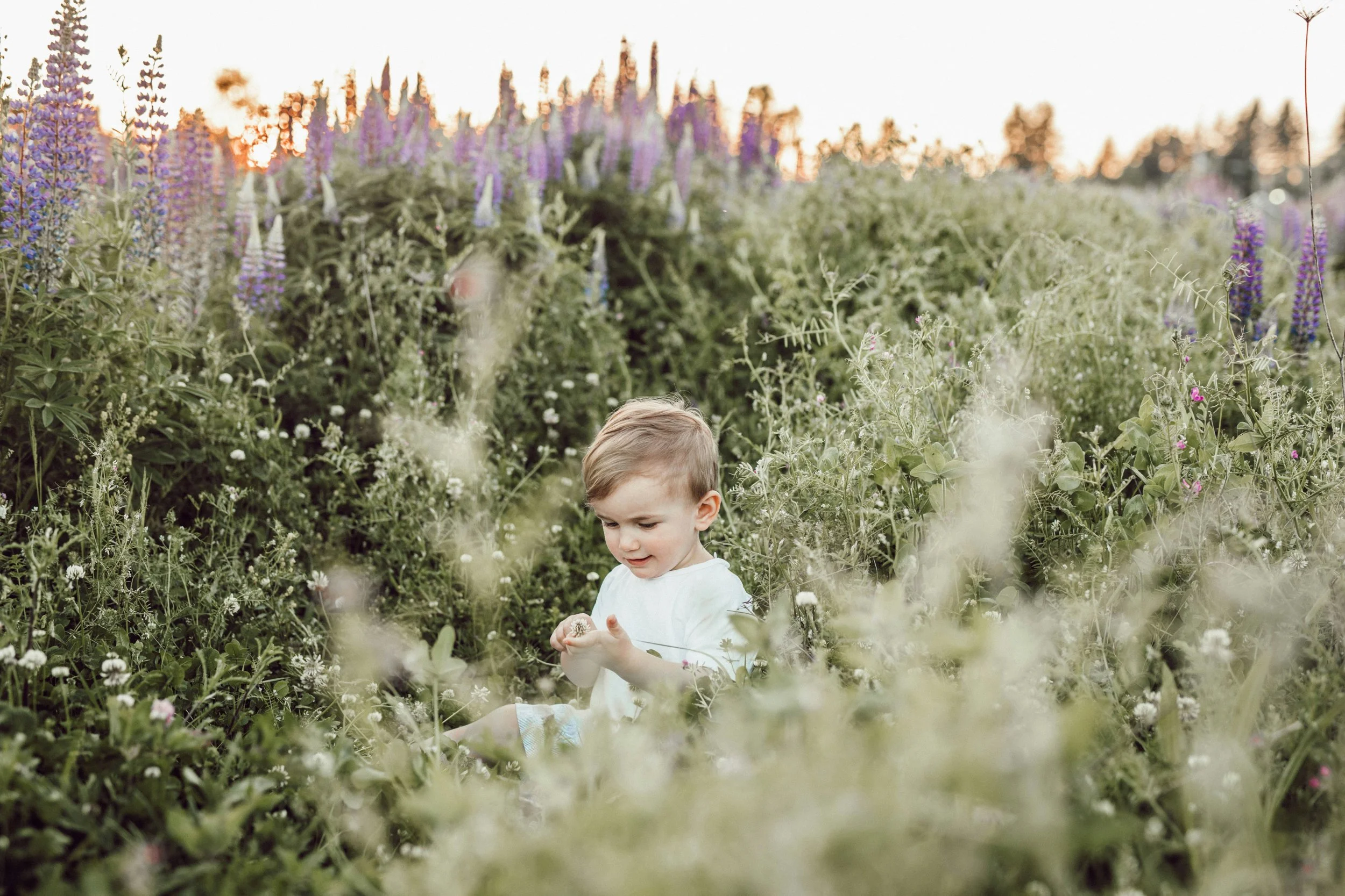
Look at the image of the child sitting in the grassy field near sunset.
In a shot like this, it’s so easy to make Mistake #2 (Heavy Contrast). If you add too much contrast here, you lose the "airy" feel of the grass and the soft detail in their clothing.
A Pro Workflow for this shot would look like this:
Foundational Lift: Open the shadows so we can see the detail in the kids' faces and clothes.
Highlight Control: Bring down the highlights so the sun doesn't "blow out" the edges of their hair.
Targeted Glow: Use a Hail Mary Mask to darken the background so the "glow" stays focused on the kids.
Skin Balance: Target the highlights on their hands and faces to keep them looking natural (watching for green color casts!).
6. Lack of Consistency
If your Instagram grid looks like a rainbow of different styles, it’s because you’re starting from scratch with every session. If you don't have a "rhythm," you don't have a brand style that clients can recognize.
The Fix: Develop a repeatable workflow. Use a consistent starting point for every session. By using the same foundational adjustments (like the ones in The Lightroom Series), your work will start to look cohesive. Consistency is what allows people to recognize a "Nancy Smiley" edit before they even see the name attached to it.
7. Crushing the Blacks for "Mood"
There is a trend to make images "moody" by slamming the Blacks slider to the far left. While this creates contrast, it also kills the detail in your subject’s hair and clothing. It makes the photo feel "heavy" and digitally strained.
The Fix: Instead of crushing the blacks with the slider, try fading them using the Tone Curve. By lifting the bottom-left point of the curve slightly, you get that moody, matte look while still preserving the information and "air" in the dark areas of your photo. I dive deep into the science of the Tone Curve and make it easy in the Advanced Lightroom training.

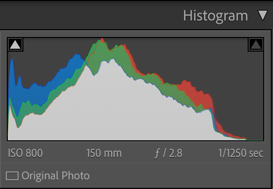
8. Ignoring the Histogram
Your eyes can lie to you based on your screen brightness or the light in your room, but the Histogram doesn't. Many photographers ignore this graph, leading to images that are accidentally way too dark or blown out when viewed on other screens.
The Fix: Keep an eye on the "mountains" in your Histogram. If they are all jammed to the far left, you're losing detail in the shadows (clipping). If they are hitting the far right, you're blowing out your highlights. A balanced, professional edit usually has a healthy spread across the middle.
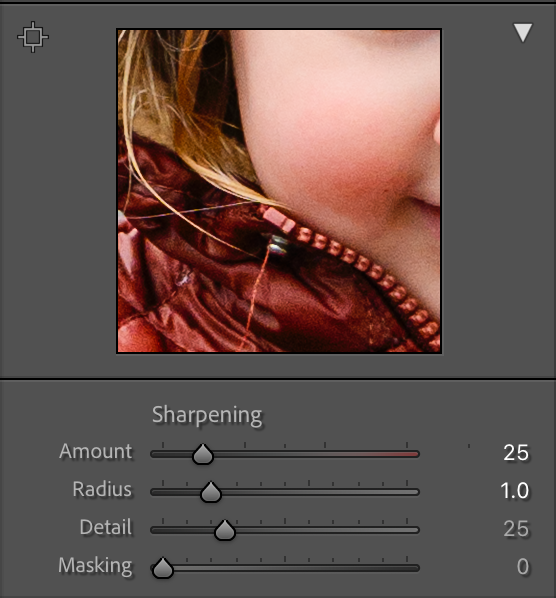
9. Over-Sharpening (The "Digital" Look)
When we want a photo to look sharp, we often overdo the Detail or Sharpening sliders. This leads to "halos" around your subject and a grainy, noisy look that feels artificial.
The Fix: Sharpening should be subtle. Use the Masking slider within the Sharpening panel. Pro-tip: hold down the Alt (Option) key while sliding it—the white areas show where the sharpening is being applied. You only want to sharpen the edges (white lines), not the flat areas like skin or the sky.
10. Not Using AI Masking to Create 3D Separation
Lightroom’s new AI masking tools (Select Subject/Select Background) are the biggest game-changers in a decade, yet many photographers are still only using global sliders. If your subject doesn't pop from the background, the whole image feels flat and "snapshot-ish."
The Fix: Use "Select Subject" to slightly increase the exposure or clarity on your people, and then invert the mask to slightly soften or darken the background. This creates a 3-dimensional effect that mimics the look of a much more expensive lens!
I’m Here For You!
Editing is a muscle. The more you train yourself to spot these small color casts and foundational errors, the faster and more intuitive your workflow will become. Stop looking for the magic button and start learning the process.
Ready to stop guessing and start editing with confidence?
My Lightroom Series is designed to take you from "overwhelmed" to "obsessed" with your results:
Intro to Lightroom: Perfect for those who want to master the interface, understand the "why" behind the sliders, and build a solid foundation.
Advanced Lightroom: For the photographer ready to dive into complex masking, the Tone Curve, and high-end color grading.
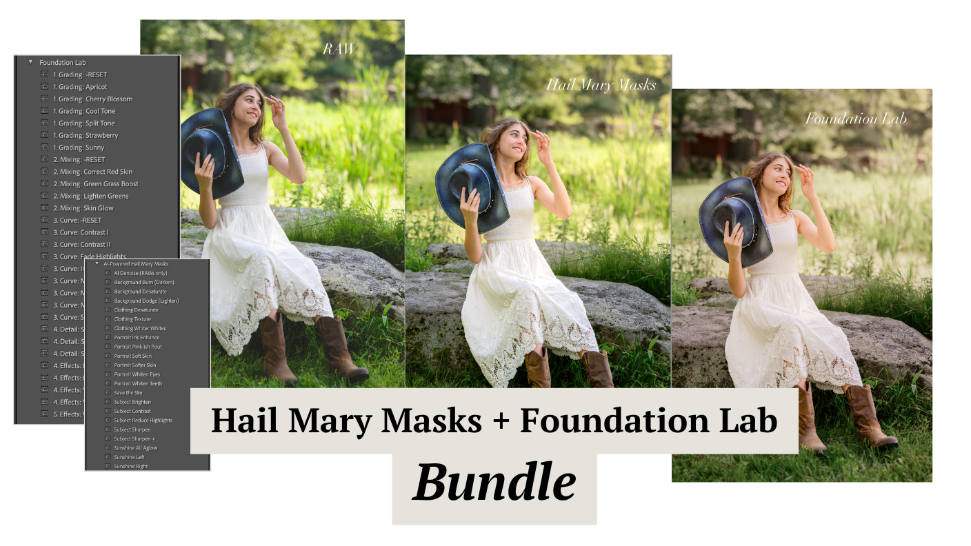
The Foundation Lab: My secret weapon for getting that clean, consistent "pop" every single time.
Hail Mary Masks: The "emergency kit" for saving those tricky skin tones and sunset highlights.
Needing to dive deeper? Check out…
The Camera Series— for mastering your gear.
The Lightroom Series— for editing.
AI-Powered Hail Mary Masks— for lightning fast, unmatched editing tools.
The Camera Series— for comprehensive, affordable trainings designed for beginner or intermediate photographers.
Nancy’s Recommended Gear— and where she buys it used (reputable with warranties!)