Flat to Fabulous: 5 Post-Processing Power Moves
If you're shooting in RAW, you've probably noticed that your images can sometimes look a little... flat right out of the camera. Don't worry, that's totally normal! Think of RAW files as your starting point, full of potential just waiting to be unleashed. And one of the best ways to do that is by adding a little extra "punch" in post-processing! 💪
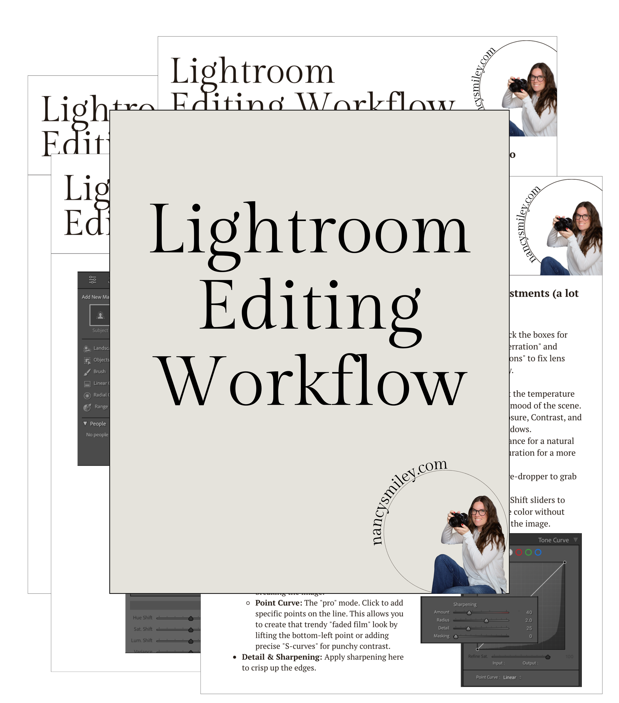
Pretty much every image can benefit from a little bit of love and care in editing. So, in this post, I'm going to show you five fantastic ways to add that extra oomph to your photos. And to make sure you don't miss a step, I've also got a free Lightroom Editing Checklist for you! 👇
I’m sure you know by now that you have to have Lightroom for these tutorials to come to life, so if you need information, here is the webpage for the Photography Plan from Adobe ($12 a month!), which is what I use and highly recommend to all of my photography friends!
Ready to make your photos pop? Let's dive in! 🚀

🎨 1) Unleash Vibrant Colors: Vibrancy vs. Saturation
Want to make your colors sing? Both Vibrancy and Saturation are your go-to tools! A little tweak can make a big difference. However, it's important to know when to use each one.
For photos with people: Opt for Vibrancy. It's a more intelligent way to boost colors, keeping those tricky oranges and reds (like skin tones) looking natural and avoiding that "glowing" effect.
For landscapes or macro shots: If you want to intensify all the colors in your image, Saturation can be your friend. You can even go a little bolder without worrying about unnatural skin tones.
Pro Tip: Before you start boosting colors, make sure your white balance is correct! A "muddy" look can often be fixed by warming up the image first.
⚫⚪ 2) Add Depth and Detail: Contrast & Clarity
Contrast is all about making your dark areas darker and your light areas lighter. A good level of contrast adds punch to your images, especially black and white photos. The amount you add is really down to personal preference and what suits the individual photo.
While you can use the simple Contrast slider in Lightroom's Basic panel, I prefer using the Tone Curve. It gives you more precise control over the highlights and shadows. Creating a subtle S-curve (add two points on the diagonal line and gently pull the top one up and the bottom one down) can add beautiful contrast without going overboard. Experiment with adjusting these points just slightly above and below the diagonal line for a nice effect.

And don't forget about Clarity! This tool adds mid-tone contrast, which is fantastic for bringing out textures and details in your images. Just be cautious when using it on portraits, as too much clarity can sometimes make skin look a bit harsh.
🖌️ 3) Sculpt with Light: Dodge & Burn
Want to subtly guide the viewer's eye and add dimension to your photos? Dodging (lightening) and burning (darkening) specific areas can work wonders! Generally, you'll want to darken areas you want the eye to move away from and lighten areas of interest.
For example, you can use these techniques to gently sculpt the light and shadow on a person's face, adding depth and definition. Remember, the key here is subtlety! Use the masking options in Lightroom to "paint" on these light and dark adjustments.


🧹 4) Eliminate Distractions: Cloning & Healing
Nothing pulls the viewer's eye away from your subject like a random distraction! Whether it's a vehicle behind your subjects or acne in a portrait, cloning, AI remove and healing tools can be your best friends.
Lightroom's AI Removal Tool makes it easy to eliminate these unwanted elements. Sometimes you may prefer the Heal option, but sometimes the Clone option works better depending on the situation. Experiment with both to see which gives you the cleanest result. The goal is to make the removal seamless so the viewer's attention stays right where you want it.


🌫️ 5) Tame the Grain, Enhance the Detail: Noise & Sharpening
If your image has unwanted noise (that grainy look), you can use the Luminance slider in the Noise Reduction section of Lightroom's Detail tab to smooth it out. Be gentle, though! Too much luminance can make your entire image look overly smooth and lose detail.
And finally, don't forget about Sharpening! If you're shooting in RAW, applying a moderate amount of sharpening in post-processing is usually necessary to bring back some of the fine details. Remember to sharpen for your intended output – what looks good on screen might need a little more or less sharpening for print.
Ready to take your post-processing skills to the next level? Don't forget to download my free Lightroom Unlocked Checklist! Happy editing! 😊